
Advantages of the Pantone Matching System (PMS)
Pantone uses a universal colour system, with updated formula guides available every couple of years to give designers and brands the choice of 1000s of colours. The great thing about working with Pantone colours is the guaranteed result of a referenced code, as opposed to guesswork. Unlike CMYK codes, PMS prevents colour inconsistency on monitors and digital screens. From the start of production all the way to the finished result, Pantone spot colours stay the same – this is one reason why we love Pantone references so much!
Disadvantages of the Pantone Matching System (PMS)
If you’re looking to create a specifically designed logo, Pantone is perfect for you. However, it isn’t always the most cost-effective method. With the material required for using spot colours, it can result in a long lead time. Technology has reached advancements to the point where CMYK can replicate PMS more accurately than previous years, so Pantone isn’t ALWAYS the right choice for everyone. It can be problematic to determine what colour is needed if both clients and companies don’t have updated versions. If the formula guides are up to date, there’s nothing but good stuff to say about Pantone’s range.
Why Doesn’t CMYK Match up to PMS?
There are a few reasons why CMYK does not match up with PMS.
Difficult to Find Exact Replica
When CMYK codes need transferring to Pantone codes, it’s impossible to find an exact replica for every single code. There are, however, a set of CMYK codes that pantones can reference to find alternative tones in place of the desired colour. This means when it comes to creating a finished result, referring to CMYK at the beginning of the process means the product might need a spot colour that isn’t printable or true to the CMYK code at all. Simply put, CMYK just doesn’t have the capacity to meet the standards of PMS.
CMYK Requires Complete Accuracy
The printing process also requires complete accuracy with the 4-colour palette, whereas Pantone removes this long process. Clients might also find they have missed the opportunity to acquire an exact colour of their choice, rather than settling for the CMYK’s range, which is why our team at Innotex recommend selecting a colour from Pantone’s range.
Pantone Matching System Has Wider Available Range
As mentioned before, Pantone is also a much better matching system simply because of the wider range available. Each spot colour can transfer into a CMYK code because of the extended colour palette, but not all CMYK codes can transfer into a PMS spot colour. As a client, referring to Pantone systems makes the process easier for both the company and you, as accurate depictions of your colour choices will prevent miscommunication, alterations and dissatisfaction.
Read Our Tips For Avoiding Dye Migration
Coated vs Uncoated Ink
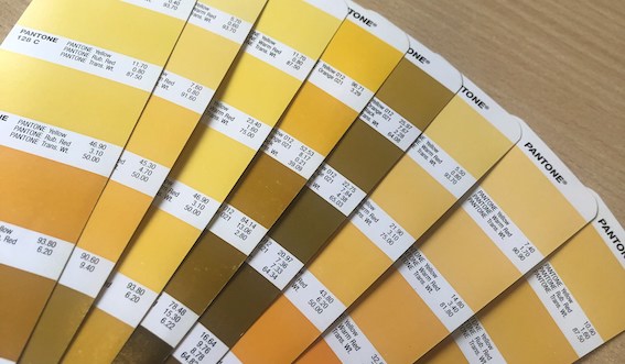
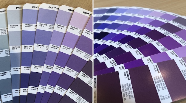
There’s a lot more to Pantone than just swatches and specific spot colours. If you’ve worked with spot colours before, you might have noticed each code either ends with ‘c’ or ‘u’. Each stand for coated ink and uncoated ink respectively.
Here’s an example of how the two types of ink work:
Let’s say you have a white paper you want to print on. If you use uncoated ink, the material will absorb the colour and give a less accurate result, but add a matte finish. If you were to instead use coated ink, the finish would be more vibrant and have a glossy effect to it.
Our studio and production teams use coated ink as opposed to uncoated ink to give clients a sleek finish with long-lasting effects and desired colours.
Can Heat Transfers Print in Both PMS and CMYK?
There are times where Pantone is the better option against CMYK, even if a transfer is able to produce prints in both. This is because Pantone has an extended range of colours that CMYK would never be able to achieve – this includes colours that replicate metallic and fluorescent finishes which can be specific to certain garments and industries. Using CMYK codes wouldn’t achieve the same result and can be time-consuming to amend.
How Can Innotex Help?
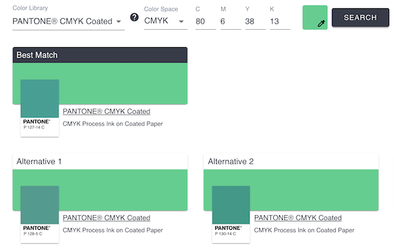
At Innotex, we refer to PMS over CMYK for the production process. If a client sends a request for a CMYK code, it’s no problem at all. We use Pantone’s online colour tool to convert the CMYK code into a Pantone reference. The tool allows us to identify if a CMYK code can be converted in an exact match of a coated colour, showing alternative colours in the event that the CMYK code is outside Pantone’s range. Our team is always happy to offer solutions and meet specific needs without extra costs!
We also offer a proofing service that allows our clients to see the final colour before the production process begins. If a CMYK code is given and the transfer can only use PMS, we will do our best to find an alternative colour to suit your needs. Our team is here to discuss all queries and find you the best route to get the most out of your design. To find out more, contact us by filling in the form or by phone during our office hours. 020 3617 8710 (Mon – Fri, 8:30am – 5:00pm)

